Monday, November 10, 2014

baby album - EJ

it's been a while since I made a baby album. I don't think I've actually uploaded their pictures.

Since I've made a few to-date, I have a rough idea how to start, but I must admit that I didn't have much time to do this and my brains were stuck.

Thankfully for a pack of baby-boy journaling cards I bought. I used more than what I expected.

for the Cover: I applied clear gesso on it, sprayed it with 2 colours and left it to dry. I then used EK heart punch to punch hearts shapes and just layer them.
I "gesso-ed" the chipboard E, J and put VersaCraft red on it.I used small lettering to put the name on the chipboard. decorated with some heart-ribbon and a bit of blings.

As this album is for a boy, I couldn't use much flowers or the like, so I ended up using wood veneers & stamps.

I used paper from a stack, so that it all coordinates. my first album was using random pages and what a headache it caused me.

pages 2&3 were dedicated to baby's family.

pages 4&5 was for 3 months milestone.
I also added an insert to break the monotony and to give some space for journaling, if so desired.
the flap was for "random facts about me"

pages 6&7 was random pictures
on page 7, I mildly decorated the page so that a full 4x6 picture could be inserted. the rest of picture slots were either 3x4 or 3x3.

pages 8&9 was for 6 months milestone.
there is also an open flap on the right for more photos.

pages 10&11 was 9 months milestone

pages 12 was dedicated to 1 year milestone though it was not explicit.I used a stamp for 'walking feet'.

There were very few captions as I was really out of ideas, although 'bath-time', 'grandparents' were among some of the pages in previous albums. Partly it was due to a lack of appropriate embellishments, which made me aware of the need to top up!

to be honest, i do have, but it was mostly for girls and the recent deliveries are going to be boys!

paper punches to create different edges and also using ribbons between pages to create textures in place of blings.

Overall, I thought it was pretty nice for a boy :)

Sunday, October 26, 2014

stamps

I bought this set  of stamps from someone else' stash and it must be one of the best addition to my collection.
As my kids love to play and I have lots of photos, it really enabled the journaling  process. 

really happy with my purchase :-)

good times - leg0 exhibition

this photo was taken almost 2 years back when we went for the Leg0 exhibition. The kids were standing over the air duct in the shop and immediately their imagination took to flight.
I remember this day because we had lots of fun. 

I haven't layered paper in a long while and wanted to do it. However, it wasn't as complicated as I would like it to be.
I used Project life cards for sentiments.
Cut out green velium to overlay, followed with an embossed heart & a brad and cut washi tape into an arrow to bring focus to the sentiment "good times".

I made 3 layouts instead of using Project Life, since Hubs commented that my layout consisted mainly of single photos. 
for the first 2 layout, I used printed paper for photo mats. it adds colour to a otherwise plain black or blue background. I used orange distress ink to bring out the photo mats from its blue background. quite happy with the effects.
with the first layout, I used paper punches to bring even more dimensions & textures.


This layout was done a long time ago, when I first started out. hopefully my skills has gotten better with practice. :-)


Tuesday, October 14, 2014

Kids wanna have fun


I finally used the Mambi Kit given to me by my friend a long time ago. "Kids wanna have fun".
I used a background from DCWV Modern Meadow Stack, with some japanese origami papers for the layering behind the photos.

I altered a chipboard sun/flower. I embossed the outside with yellow. for the middle, I used red Versacraft and then embossed it with gold glitter.

All the accents & sentiments comes from the Mambi kit, except for the 'grass' at the bottom. Those are die-cuts I bought from the store.

I used good, old cotton wool for clouds & a bird brad. I folded the corner down and used sky-blue versacraft ink to colour both the white background and the white card-stock I've sticked behind it.

As for the little banner behind the word "kids", I used the banner chipboard that came with the kit. I traced it onto paper, cut it, and inked it with purple versacraft ink (again).

One thing I discovered:
1. I like DCWV paper pads
2. I like versacraft pigment inks, compared to distress inks. I believe it has to do with the range of colours available. Somehow with distress inks, not only are they expensive but there is a limited range of colours.
3. Paper layering is a great way to give depth to a project.
4. Chipboards! super fun. will start buying/hoarding them :)

Saturday, June 28, 2014

We love you daddy

I was/am very inspired by one of the layout done by Jelibeanz and I tried a bit to layer my photo with flowers. turned out to be quite simple.
Once again, I used my white felt lettering and inked it with my red Versa and I had beautiful lettering red lettering :-)
I also used my new EK <3 stamps and embossed it. However, the effect of red ink with clear emboss wasn't striking enough. I have since bought red emboss powder to use with my red ink. :-)

Monday, June 23, 2014

First foray into cards

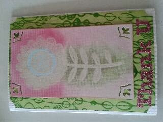
I made this card for Vicky's piano teacher who is resigning.
the techniques and inspiration came after I attended a class at JDA.
I learnt background stamping (green) and white-on-white stamping, with masking. 
I liked what I learnt and would want to do more stamping soon!

I realized that mixed mediums is much more fun than die-cuts. although they are not complimentary. it's still essential to have a few paper punchers etc. Die-cut machines will be able to give your product the neat professional look. but I'm still wondering if it's worth the cost & the space! 

Wednesday, June 4, 2014

Childhood friends

I wanted to do a black & white theme but I really didn't know how and where to start.
After some searching on the internet for ideas, I have finally decided on a black & yellow theme instead.
I'm still quite far from my desired standard of layering but I'm working on it. Think I will have to attend some class sooner rather than later.

1. I used a stencil, neon yellow ink for the background yellow dots
2. string & yellow stickers for the top banner, which small boy/girl punch out.
3. my lettering was white felt, which I then sprayed with Mr Huey's yellow mist to stick to my colour theme.
4. Black & white washi tape interlaced with string
5. cutsie post-it stickers for the "little men" running
6. Feckle Fawn Enamel dew drop stickers.
7. brad with a chipboard tag